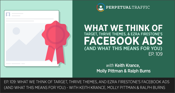


Want to stop the thumb scroll and have your Facebook ad stand out on the news feed? Then join the experts as they critique seven Facebook ads from companies big and small.
Learn the mistakes to avoid and gain actionable strategies that can be applied by any industry to create effective Facebook ads.
Find the images of each Facebook ad critiqued in the Resource section and podcast transcript below.
IN THIS EPISODE YOU’LL LEARN:
- How to portray that your product will elevate your customer’s status, making it a more desirable purchase (« Hint: It’s one word).
- What your ad image needs in order to stop the scroll and stand out on the crowded, competitive news feed.
- The phrase to include in your ad copy to effectively introduce the value your product brings (« if you’re ever stuck with your copy, you can always use this phrase).
- A simple retargeting ad anyone can replicate – no matter your industry – that generates social proof.
LINKS AND RESOURCES MENTIONED IN THIS EPISODE:
Episode 67: The Proven 3-Step Formula to Transform Your Business with Video Ads [Part 1]
Episode 68: 3 Elements of High-Converting Video Ads [Part 2]
Episode 84: Ryan Deiss: 7 Questions I Ask Myself Before I Finish Writing Ad Copy
Molly Ads:

Ralph’s Ads:


Keith’s Ads:
Watch SharpSprings’s Facebook ad here.

Watch Neurohacker Collective’s Facebook ad here.
Episode 109 Transcript (swipe the PDF version here):
| Keith Krance: | Hello and welcome to Episode Number 109 of Perpetual Traffic. This is Keith Krance, and on today’s episode, Ralph, Molly, and myself are each going to take you through some specific Facebook ads we’ve seen in the news feed, or on the right column. We’re going to tell you what we liked about those ads or maybe what we didn’t like about an ad. Each of us have two to three specific ads that we’ll either tell you why it’s a good ad, why we believe it’s a good ad, or why we believe another ad is a not-so-good ad, and, of course, why. Like always, any resources, images, screenshots, anything that we talk about today, we will have over at the Show Notes at digitalmarketer.com/podcast. This is Episode 109. |
| All righty. Let’s get into it. We’re going to let Molly kick it off and it’s going to go Molly, Ralph, then Keith. | |
| Molly Pittman: | Hey, guys. Molly here. I have two ads that I think you’re really going to like. The first one is from ThirdLove. They sell women’s undergarments. What I really like about this ad is how the ad copy speaks to an elevation in status. I believe in every market, and with every product or service, you can really portray how consuming your product would elevate the status of the end user. So, ThirdLove’s ad says, “Ready to graduate from Victoria’s Secret? For a limited time, try our best-selling bra, risk-free, for 30 days. If it’s not your new favorite, return it for free.” By opening the ad and saying, “Ready to graduate from Victoria’s Secret,” they’re not saying anything is wrong with Victoria’s Secret. They’re just saying, “Hey, we are the next level,” right? “We’re the next step up. We’re the increase in status from Victoria’s Secret.” Even if you like Victoria’s Secret … It’s not a negative thing toward Victoria’s Secret. Even if you like it, you might question, “Wow, am I ready to graduate to the next level? Am I ready to purchase bras that are of a higher quality?” It’s a really, really smart ad copy. |
| Then, the images are a carousel of different bras with different colors, just laid nicely on top of different shirts. They’re displaying their different products in different colors in a really eye-catching, very nice way, under the carousel card that says, “We believe fit should come first.” Overcoming a big barrier to entry for most women with bras is obviously the fit, so really, really smart to use that copy in the first card. And then in the card on the right, it says, “Start your 30-day free trial,” which is also very interesting because that’s not how you would normally buy an undergarment is through a 30-day free trial. I just thought this was a really great ad, especially for ecomm people. Really eye-catching. Love how they’re really speaking to people’s need to elevate status by saying, “Ready to graduate from Victoria’s Secret?” I think the images look great. So, well done, ThirdLove. Go to their website and get pixeled by them, so that you can see their ads. They do a really good job. | |
| My second ad is actually from Target. Usually, I think the big guys have trouble with Facebook ads, but this was really great. They were targeting people who had already bought from them in the past, and it was to get you to sign up for Target subscriptions. It says, “With Target subscriptions, you’ll save 5%, get free shipping and never run out of your daily essentials.”
|
|
| What’s really cool is that it’s showing you, without even having to say it in the ad copy, “Hey, we will deliver all the stuff that you always need. The toilet paper, the detergent. We will do so on a scheduled manner, based off of your calendar. This is Target subscriptions.” Really, really great ad. Below the ad, it says, “Start a Target subscription today. Make sure you stay stocked up on everyday must-haves like detergent, toilet paper, coffee.” I actually would have put that line of copy at the top, so that people who aren’t very visual and didn’t understand that you would deliver toilet paper, detergent from the image, would also be able to read that in the copy. I think they could have done a little bit more with the copy, maybe speak to, “Hey, isn’t it a pain to go to the store for these things that you always know you’re going to need? Don’t worry, we’ll deliver them to your doorstep and you’ll save 5% and get free shipping.” They could have added a little bit more to the ad copy there. But overall, great ad. Really, really love the image. | |
| As always, if you want to see these ads for yourself, go to digitalmarketer.com/podcast and thanks for listening. | |
| Ralph Burns: | Hey, this is Ralph with my three critiques of ads that myself and the team here at the agency have found in the last couple of months. We’ve got two ones that we really like and one that we don’t like so much. Let’s get right into it. The first one is from Thrive Themes. This one was found by Deacon, our awesome ops director here at the agency. One of the things I think is great about this is that it’s visually … I don’t know if arresting is the right word, but it definitely stands out in the news feed with an image immediately. It’s like green, brown, contrasting colors. The exact kind of … Sort of almost vector type of images and it stands out just visually. It definitely stops the thumb scroll, which is one of the things that you really want to do as much as you possibly can as long as it’s consistent with your brand and consistent with your message. |
| One of the things that we really like about this is not only just the image, which was the first thing that I certainly noticed, but one of the things that it does do is that the image reinforces the hook on the ad copy itself. The ad copy itself is not traditional type of ad copy. It’s not the type of ad copy that you would see on a sales page for old-school digital or internet marketing. It’s much more of a story and it talks about how a recent discovery, from Bryan Harris of Videofruit, found that an upside-down homepage increased sign-ups. | |
| First off, when you click on this ad, it takes you back to the Thrive Themes page, which is in the same colors, same sort of visually standing-out-in-the-news-feed colors. But the picture that’s actually in the image is of a woman doing a handstand, upside-down. It immediately reinforces the hook in the ad copy itself. Remember, I mean, images should really convey the hook and the marketing message. They should tell sort of a story, as much as you possibly can, or maybe even display the product in some way, shape, or form. But the most important thing, I think, is that you really do … Especially with all the competition that’s in the news feed right now … is stand out in the news feed and this certainly does this, with really clean graphics. I think it’s definitely on-brand, without a doubt, as it definitely has really good ad scent, is what we would say. The same sort of color scheme in the image goes right to the landing page and it reinforces the message all around, so a super-good ad by the folks at Thrive Themes there.
|
|
| Another part to this is that the headline is really good. It’s really a basic headline. If you ever have trouble copywriting, you can always go back to the how-to headline. It’s probably the most popular headline. Not because you want to be doing what everybody else is doing, but how-to is just a great way to introduce whatever it is that your product or your service offers as a potential solution. In this case, the headline that’s slightly below the image says, “How to make an upside-down homepage step-by-step using … ” and they have the plus sign, which is always cool, “… + free template.” Super good image, some good copywriting here and message-to-market match from the folks over at Thrive Themes. | |
| The second one is a little bit more puzzling. This is one that Rob, who is one of our awesome account managers here at the agency, had found. These are the kind of ads that we just shake our heads at because we’re not really sure why this particular person is actually advertising. Maybe this works. I don’t know if it does. My guess is that it probably doesn’t work all that well, but this is the kind of stuff that whenever I think Molly does any sort of creative or any sort of presentation on how to create a creative, it’s do not do this. What it is, is it gets your attention in the news feed because the image is a picture of a cute little puppy. The ad copy is … I don’t know if this works. Maybe this does work. The guy could be making millions of dollars on this ad. But it says, “Nothing to sell. I’m just buying up ad space and filling it with puppies. Enjoy your day.” Then, the headline is, “Enjoy your day,” as well.
|
|
| It is a link post, so it actually goes to a landing page. Maybe for his audience, this actually attracts the right type of customer. I don’t know. But it’s very counterintuitive to us inside the agency. No real message-to-market match from the image to the landing page. The landing page itself is … You know, the only thing that I would say on the landing page is actually is that it has an arrow that points to where you should click after you enter your email, which I think is actually pretty good. But aside from that, from ad to the landing page itself, it’s really very disjointed. One of these types of ads that, hey, if you want to just test it and see if it works … My sense is that it probably would not. But I think this would be more of an example of what not to do, but you never know. Jordan Carter might be totally cleaning up on these ads. But certainly not the types of ones that we would typically run here. That’s one that we don’t like. | |
| Moving onto the third one, this is one from one of our favorite people in our space, Ezra Firestone, the man-bun himself. All of his stuff is really awesome. He’s a great teacher, comes out with really innovative concepts, especially in the ecommerce space. One of our team members is actually at his event this week in Austin, so that’s how much we love Ezra. So, not surprising that he has some kickass Facebook ads that we’ve all seen in the news feed. This one in particular was found by Franny and Tracy, two other people inside the agency here, our awesome Creative Director and one of our awesome account managers. They found this one from Ezra Firestone, which is just a simple representation of what looks like a retargeting ad to get people back to buy … or to actually watch a webinar, which helps you to scale your team. Sort of a cool little image that he has of a guy on a desert island and it says, “Don’t miss the boat. Learn how to scale your team.”
|
|
| For a retargeting ad, I think this is really pretty awesome. I think we tend to use a lot of the same type of copy, did life get in the way, that kind of thing. Did you miss it? That kind of stuff. I think we all tend to get into our ruts as far as how we write certain types of ads, and I think Ezra here did a really good job. Because it’s an Instagram ad, he’s formatted his image specifically for Instagram, so it’s not the 1200×628 image that we typically all see inside Facebook. If you really do want to leverage Instagram, I’d suggest to crop your photos or at least have images that fit in the Instagram news feed. So, he’s used the ideal image size for this Instagram ad. I think when you’re creating ads inside Facebook, we tend to all kind of use the same image size for Facebook as well as for Instagram. I think you can certainly get good traction inside Instagram as an adjunct to your normal Facebook ads, as well as the audience network, which we are starting to use a whole lot more. But if you format … And there’s actually a way to do this now. Inside the ads manager, you can actually format your images to appear on Instagram in its ideal format. So, in this case, Ezra did exactly that. | |
| The ideal size is about 1080×1080, but you can also do a landscape, like typically what we’ll do. Also, you can do a square, which is basically 1080×1080. You can also do vertical, which is about a 4×5. So, if you are going to be using Instagram to really underscore your message in your ad copy or what you want the user to do, I would highly encourage you to format your images specifically for Instagram by using the 1080×1080 or the 600×750 pixel, which is a 4×5 vertical type of image with your ad. It looks like Ezra probably did about a 4×5 here, which … It looks really good. | |
| The ad copy in this one is really simple. It really just does appear as the headline underneath, in brackets, “Last chance. Learn the system I used to …” so forth and so on … scale my team out and scale it to the size that his business is now. It’s a good, just simple ad, just to remind people … Probably warm traffic, retargeting only … to get their butts back in and watch that replay in order to learn how to scale your teams. | |
| One thing that the team here actually thought he could improve on is in the little boat that is sailing away from the guy who’s missing the boat on the island, is maybe to have more people on the boat. Right now, he only has one guy and there’s a little shark in the water here. But, yeah, we would probably add a few more people on there, so you don’t miss the boat. How to scale your team. Obviously, we’re talking about more than one person, so that’s just a small critique here. But aside from that, I think this is actually a really, really solid ad and a great way to leverage what has become, for us, a very powerful medium, a very powerful placement, which is Instagram in particular. Once again, like the Thrive Themes ad, the image just simply reiterates or underscores the message that’s in the hook and that’s in the action that you want the person to take. | |
| It certainly looks like an ad. There’s no doubt about it. But it’s very friendly-looking and I’m sure this gets really great click-through rates and probably very good show rates on the replay. | |
| Those are my three critiques from this week. Talk to you soon. | |
| Keith Krance: | All right. I’ve got two ads here. The first one is by SharpSpring. It’s all one word. SharpSpring. It’s a 15-second video ad with no sound. It’s pretty funny. It’s a very short copy ad. It’s a short ad. Like I said, it’s 15 seconds. The one thing about the 15-second ad that you want to start being cognizant of is that if you have a 15-second or shorter video, you’ll be able to run pre-roll ads, where your ad automatically plays at the beginning of somebody else’s video, like they have over at YouTube as well as … You’ll see on some of the players at big websites, like Fox News, CNN, MSNBC. They are slowly rolling this out. Right now, we don’t have a ton of details on how to do this and where you’re going to be able to do this. But just be cognizant of this if you are making your video ads. |
| This ad is pretty funny. It’s a silent video with a girl and a guy, sitting at their desks with a window behind them of New York City. They’re both doing the happy, celebratory dance, right? She’s clapping her hands slowly … And it’s in slow motion. He’s just really funny-looking and he’s just kind of doing the same thing, snapping his fingers. They’re both moving all around. It’s just a short, to-the-point ad and it says, “Get all the right marketing automation moves. Compare the top six vendors on price, features and reviews.” That’s it. There’s no link in the ad copy. Below the video, the headline is, “Guess who picked the right marketing automation vendor?” It’s them two celebrating, right? Then, below that is Free 2017 Vendor Review Guide, and then Learn More is the button. Now, this is actually a lead ad. So, when you click Learn More, it just pops open another window, like a light-box type of thing. You can opt-in to receive the 2017 Vendor Review Guide.
|
|
| Couple things here. I like this ad because it really just uses the emotional trigger. If you think about, and go back and listen to Episode Number 84 with Ryan Deiss. Ryan came on and he talked about the seven questions he asks himself before he finishes writing any ad copy. Throughout that episode, he really talks about how can you portray an emotion that somebody totally just gets right away, or something that’s very common? Molly’s talked about using the cell phone battery, the image of the cell phone battery, where it’s red, you know? Where you got the bar and the battery is low? They’ve used that image for offers that expire and those types of things and it’s worked really well. I think this kind of has that same feel, because everybody has either done that, joking around, or they just get it. They know they’re celebrating. People will share this because it has some funny elements to it. | |
| Now, two things. Number one is that if you’re going to run an ad like this, you’ve got to have a pretty small, pretty narrow audience. I probably wouldn’t run an ad like this unless it was warm audiences, like retargeting people that you know already knew about marketing automation. The reason why is not because of the video. I think the video itself, of them celebrating and portraying that emotion, could work for super broad, huge audiences, cold audiences. But because of the copy that they use … It’s very industry jargon-ish. It’s got, “Guess who picked the right marketing automation vendor?” The first line in the copy is, “Get all the right marketing automation moves,” so you’ve got to be targeting a very focused audience, people that are decision makers in businesses. They understand. They’ve looked at different marketing automation platforms, probably a lot of enterprise-level solutions. | |
| So, if their ad copy was speaking around something that is a little bit more basic and simple, but related specifically to sales, communicating with their audience, or increasing their ROI or their sales, that’s just super nit-picky there. However, for the right audience, this is the exact right ad copy. Basically, this is really just speaking to those people that they know are searching for marketing automation tools or looking to change. Just be careful having this type of messaging. But in general, I like the ad and I would absolutely love it for a retargeting ad, targeting to people that have already taken a look at your offer or are on your list. | |
| All right. The next one. I love this one because it’s simple. It’s simple and anybody can do this. This is an ad by The Neurohacker Collective for their product, Qualia. Qualia is a nootropic, okay? It’s a supplement to help people improve their cognitive performance, basically. Think more clearly, be more productive, efficient, more creative. This is a retargeting ad, because I know it is, because I had recently been to their site. A friend of mine had actually mentioned them in just a post from his personal profile. Love this ad here, because this is a retargeting ad to somebody that maybe went to their store and hadn’t yet bought and I actually went and bought the product. I was actually skimming the news feed, looking for some example ads and stuff like that. I saw this, and then I actually went and I actually bought it because I’ve actually tried it, a long time ago, and I liked it. | |
| But what they did was they just took a testimonial video from one of their customers, and somebody who has some authority in the health and fitness space, Mike Bledsoe. Michael Bledsoe, it says on the thing. Mike, coincidentally, is actually a friend of mine. I actually spent 10 days with him, and his partner Doug, down in Peru a couple of years ago. That was pretty cool. He has a very large audience in the health and fitness space. He’s got a podcast called Barbell Shrug and Barbell Business. They are huge in that CrossFit space and that side of the fitness world. | |
| But this ad was actually a right column ad, and I didn’t get the screenshot before Facebook reset it. But I have the screenshot, over at digitalmarketer.com/podcast, Episode 109, of the ad. I will also post the link to the actual video. It’s the screenshot of the video, with the content below it. It looks a little bit different than it would as an ad. As an ad, the content, the post copy, where it says, “Listen to fitness expert, entrepreneur Mike Bledsoe, explain how taking Qualia has brought him mental and physical clarity,” and then it links out to their landing page, neurohacker.com/qualia. That’s it. If it’s a news feed ad, that copy is going to be above the video. Then, if it’s a right column, that will be a little bit below the video.
|
|
| There’s no other part of the video on the front. It’s not like their business talking, and then him, and then something else after with a bunch of production and editing. This is just a video that Mike sent, from his office, and they just use the video and added, “Boom. Listen to this. This is third party credibility.” There aren’t many things that can beat a customer giving a product an amazing testimonial video. All right? I love this because anybody can do this. You don’t have to overthink it. We’ve talked about this before quite a bit, especially for somebody that’s visited your sales page and you’re just targeting people specifically that have not pulled the trigger. You don’t have to get fancy. We’ve done this before in other accounts, with our client accounts. This is not a client of ours, but it works really, really well and it’s easy. Okay? | |
| This video’s got 96,000 views. It’s got 757 reactions — likes or loves, et cetera — and 86 shares. The like to share ratio is not great, but it’s also … It’s a selling type of ad, because they’re saying, “Go buy our product,” so that makes sense. But it’s also only going to be to warm audiences. The first video I showed has 115 reactions — likes or loves or hates or whatever — and 18 shares. That’s actually not the greatest like to share ratio either, so I’m curious to see how that video does. It could be just because of the copy itself. Like I said, it’s not really delivering any value. It’s funny, but I think it’s a great ad to fit in to everything else that you’re doing. | |
| Those are the two ads. Now, I have one more that I can’t reveal because these guys are one of our coaching clients in our Navigator group at Dominate Web Media. But I still have their video ad and they follow our three-step video ad formula. We’re actually going to be doing some free trainings over the next week. If you go to dominatewebmedia.com, you’ll see something there about it. We’re going to be doing some free trainings, where we’ll be showing you and revealing more of this. As well, Ralph Burns and myself are going to be talking at Content & Commerce. This strategy is part of our talk. We did a little bit of this at War Room and people really liked it. | |
| But this video here is eight minutes long. It’s got 2.2 million views … Of this version of the video ad, of course … 2.2 million views, 21,000 reactions — likes or loves, et cetera — and 25,000 shares. Okay? 21,000 reactions, 25,000 shares. We’re talking like a 1:1.2 ratio, so more people are sharing it than are liking it. That’s a big deal. That means these guys are getting rewarded in a massive way with cheaper impressions, cheaper conversion costs, et cetera. This ad is going directly to a $100 product. It’s an information product, and it just delivers tons of value. It’s teaching you something, and it’s given people awe moments with something they didn’t realize that they could do. | |
| Then, it’s, of course, seeding, S-E-E-D, like planting seeds … It’s seeding the next step, which is their course, or their content, on the video that they can watch on the sales page. It’s a strategy that we talk about. We talked about it on Episodes 67 and 68. Like I said, we’ll have a lot more updated version and some free trainings this week and at Content & Commerce event in LA in September, DigitalMarketer’s event. But it’s just another great example of not necessarily listening to all the so-called experts, saying, “You have to have a two-minute video or a 30-second or less video.” This is delivering tons of value, and it’s making a lot of money. | |
| Now, to respect their privacy, I can’t show the ad itself. But we go through the formula on the podcast. We’ll be going through it more through those series of trainings, as well as inside our Navigator coaching group. We’re opening up enrollment for that, and we’re going to be doing a live meetup here, out in Seattle, to hang out with us in September, about a week and a half before Content & Commerce. That’s it. Hopefully, you enjoyed those ad critiques. Once again, you can head over to digitalmarketer.com/podcast. This is Episode 109. For the screenshots, any links that we had access to. We give you and anything else. Hope you enjoyed this and hope you took at least one or two key things away from this, or had an aha moment or two, and you can implement it in your business. Till next week, talk to you soon. Bye-bye. |
Thanks so much for joining us this week. Want to subscribe to Perpetual Traffic? Have some feedback you’d like to share? Connect with us on iTunes!
iTunes not your thing? Find us on Stitcher or at DigitalMarketer.com/podcast.